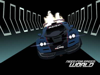
It's time for the world cup, so here is my poster :)
Wednesday, 11 June 2014
Friday, 30 May 2014
Thursday, 17 April 2014
Thursday, 10 April 2014
the groundhog day house
I found a picture of this house while looking through a
newspaper, the house from the Groundhog Day film.
It looked quite interesting to me and i thought that it
would translate quite well into an illustration, this is one
of my first tries at drawing architecture in detail and I'm
quite pleased with the out come.
Oh and incase anyone is interested the reason this house
was in the paper is because it recently entered the market
for a cool 1 million dollars, which I don't think is too high
for a house of that size.
Labels:
architecture,
black & white,
drawing,
house,
illustration,
painting,
pen,
water colour
Wednesday, 8 January 2014
TIME 4 2014
A quick poster design for the new year
featuring time and space because that's
how a year is measured. Reminds me of
a 1980s documentary video box cover.
Labels:
2014,
illustration,
poster,
space,
time,
type,
typography
Wednesday, 11 December 2013
bbc news ident
This was a quick day and a bit project that I challenged my self to do.
This is not a radical redesign but just my version of a simple update to
the current ident used.
Music by Adam Haynes https://www.youtube.com/user/petaldance
Music by Adam Haynes https://www.youtube.com/user/petaldance
Wednesday, 20 November 2013
Lady in a Red Hat
A drawing based on a photo in a magazine.
I feel that the water colours have made this image
look similar to early 1950's advertising illustrations.
Wednesday, 23 October 2013
It Came From The Deep
Labels:
black & white,
creature,
drawing,
film,
illustration,
lobster,
man,
poster,
sketch,
sketchbook
Wednesday, 24 April 2013
City of London
I fancied trying to do a technically challenging painting
and this took some time to try and get the details right
on the locomotive, but I'm pretty happy with how it's
turned out. The scenery (background and foreground)
may need a bit more work and detailing, which I might
work on again at a later date.
Labels:
A2,
acrylic,
British,
city of London,
crimson red,
drawing,
Duchess,
illustration,
LMS Coronation Class,
locomotive,
main line,
painting,
poster,
rail,
steam,
train,
William Stanier
Friday, 19 April 2013
nfsw wallpaper
Tuesday, 1 January 2013
Monday, 31 December 2012
shampoo
Just a doodle trying to re create a shampoo
poster. All shampoo ads need a minimum of
two basic things; the product placement, which
is the bottle, and what that product does,
which is the swishing hair.
Tuesday, 18 December 2012
Saturday, 17 November 2012
Robo. Co-D and the Mantis
A second short episode using my robotic character.
This time the
animation test was to try and bring more
life to the robot by bringing
in another life form
for it to interact with.
Monday, 17 September 2012
vw new beetle cup
Just a random experiment with red,
black, and white bold colours and
contrast. Maybe the font needs to be
re-thought. But the original Idea was
that the harsh red and scratchy type
would represent a bad but fun side
to this car.
Sunday, 9 September 2012
BMW 507
A poster design inspired by the colours used
on old posters and the colours of ageing
papers, with a strong black and white
contrasting object to draw the eye which has
an appearance of a news paper clipping.
Suggesting that prehaps someone has clipped
this car out of an advert because it is one that
they hope to buy in the future.
Thursday, 6 September 2012
Volkswagen Golf Mk4
A VW Golf MK4 poster made from a photo
of a model and then heavily contrasted and
colourised in photo editing software before
applying a vector based background and text.
Labels:
golf,
graphics,
illustration,
mk4,
model,
photo,
poster adver,
t car,
vectors,
volkswagen,
VW
Friday, 11 May 2012
the praying mantis
A little character that I have created in 3D software after following a
simple tutorial
( http://cgcookie.com/blender/2009/08/28/modeling-a-praying-mantis/ ).
I then added a rig to this mantis to allow me to pose it for this poster.
Hopefully this mantis will appear in a short animation soon.
simple tutorial
( http://cgcookie.com/blender/2009/08/28/modeling-a-praying-mantis/ ).
I then added a rig to this mantis to allow me to pose it for this poster.
Hopefully this mantis will appear in a short animation soon.
Labels:
3D,
animation,
art,
blender,
cartoon,
character,
comic,
coming soon,
green,
illustration,
insect,
poster,
praying mantis
Sunday, 6 May 2012
Taking it for a spin
Taking It for a Spin. A simple computer animation about a Stig like character jumping into a classic sports car and hitting the roads within an empty city. (He basically just goes round the block). With music then composed for it later by Adzin Music (Adam Haynes)
Tuesday, 13 March 2012
Subscribe to:
Comments (Atom)


